blog
Font, Colours and All Things Typographical
Let’s Begin with Typography and Font
To begin with, let’s talk about some of the most commonly used font that our own designers at Budget Banners love. These have been trialed and tested to prove their effectiveness in branding and advertising.
- Something we really like is the Century Gothic. It is a relatively new font that has risen to popularity in recent years. It’s a geometric sans-serif typeface that’s being used by many large corporations for their logos and advertising. One of which is South Africa’s favourite: Woolworths. We love to use this font for anything from gazebos and umbrellas to flags and buntings. The letters are so clear that you will be able to read it even when the printing medium is flapping around in the wind.
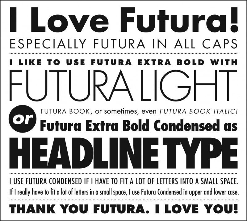
- You can’t talk about Century Gothic without mentioning Futura (which gave the inspiration for Century Gothic). This font was wildly popular and became so successful that it inspired the creation of many fonts in the sans-serif category, including Spartan, Twentieth Century, Airport, and Kabel just to name a few. It is the preferred choice of many international corporations such as Volkswagen, Crayola, HP and IKEA. This is the font we prefer for our more corporate clients, usually on the business cards and such.
- So enough of the boring normal fonts, let’s move onto happier font types. Recently we have fallen in love with the Hello Goodbye font. Despite the font looking like a child’s scrawl, it is surprisingly functional and fun. The seemingly untidiness gives the font character, so we love how it has its own personality. Flyers and banners printed with this font just make people happy, us included. Of course we would suggest against using it on a formal corporate banner.
- Speaking of fun fonts we enjoy working with, we have to tell you about the Al Fresco. Rumour has it that the word “irresistible” was used as the design template for this extravagant font type. The swish swash of the letters gives a romantic flair. However, as pretty as it is, we would advise against using it on any printing that has heavy text. People will not have the eyesight or patience to read a flyer that’s completely printed in this font. Rather use it lightly in your logo only. You know where this font would look great? Custom printed cushions or that nice canvas on your living room wall!
Now these are some of our favourite fonts. What about our favourite colour? If it were up to me, the world would probably be all rainbows and glitters. Understandably that obviously doesn’t work for most of our clients. Colours evoke emotions and behaviours within people. It is likely the first thing your potential client will see when they look at your bunting or your banner. Therefore, colour can make the difference between a wonderful first impression and your flyer being tossed out of a car window.
Importance of Colour Picking
- One colour we use often is blue. It’s a surprisingly difficult colour to work with considering its simplicity. Usually we use it as the predominant colour for corporate branding products as it reflects professionalism and intelligence. However, a wrong shade of blue can have disastrous effect. Imagine if your lawyer handed you a powder blue business card or if your friend’s baby shower banner came out a navy mess.
- For our outdoor products like umbrellas, flags, gazebos, our clients love to have a yellow hue. The colour is just so bright and happy that it will immediately uplift the mood of your outdoor event. The colour exudes tons of optimism and confidence. The light shade makes words super easy to read. If your company details or advertising slogans are printed on an umbrella, you would not worry about whether your client can clearly see the text, because they will.
- For the more formal or sombre event, no doubt we will pick black as the main colour scheme. The colour radiates intricacy and glamour. Business cards with some black detail seem sleeker and more sophisticated. Although you might need to be careful of the oppressiveness that can be associated with it. Your banners and flags should be radiant and eye catching, too much black can cause your print to be too heavy.
- On the bright side, we love to use a lot of green. The colour is refreshing and is actually good for your eye sight if you stare at it long enough. Green is most often used to portray environmentally friendly concepts. Using it on your branding or advertising can immediately make your clients assume that your company is environmentally conscious (even if you aren’t).
- And we are leaving our favourite for last: red. Red is such a passionate colour and can bring up so much emotion. It reflects warmth, courage, and romance. Imagine a bland white wall in your home, now add a mounted canvas print with a splash of red. It will instantly brighten up your ambiance.
Now of course there are plenty of other colours (the ladies at Budget Banners vote pink and purple) that work well on a variety of products or printing. These are just the basic pallets designers work with.
For the perfect print, find your favourite font and pair it with your favourite colour. We are sure something amazing will come out.
Check out our brand new Infographic with Tips on How to use Colour when printing your first Banner!


