blog
Colour Meanings and Business Card Design
It happens on a subconscious level, but we’re all influenced by colour! We have connotations with colour that can influence our mood and perception of a product or brand. They can even influence our actions. When you spot the red and yellow arches of McDonalds it can make you crave fast food!
So with that in mind it’s crucial to choose the right colours for your brand and business card designs. The colours should reflect your brand, brand ethos and product you sell, to guide those who look at your card to get a certain feel for your brand and encourage emotions or buyer activity.
To understand what colours to use for your business card, let’s take a look at the colours and what associations they have:
Colours and their Meanings
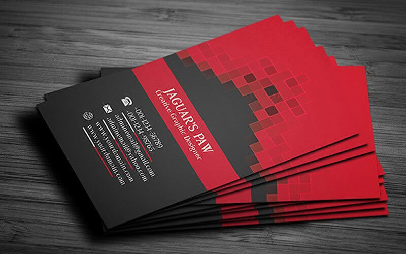
Red
Red is a bold, energetic colour that comes off as youthful and inspiring, a colour that stands as a call to action in itself. It can also instill a sense of urgency and energy. Red is also believed to stimulate the appetite, as we mentioned before for Mcdonalds. If you want to draw attention to a particular piece of information on your business card consider highlighting it in red if you’re a bold, energetic brand.
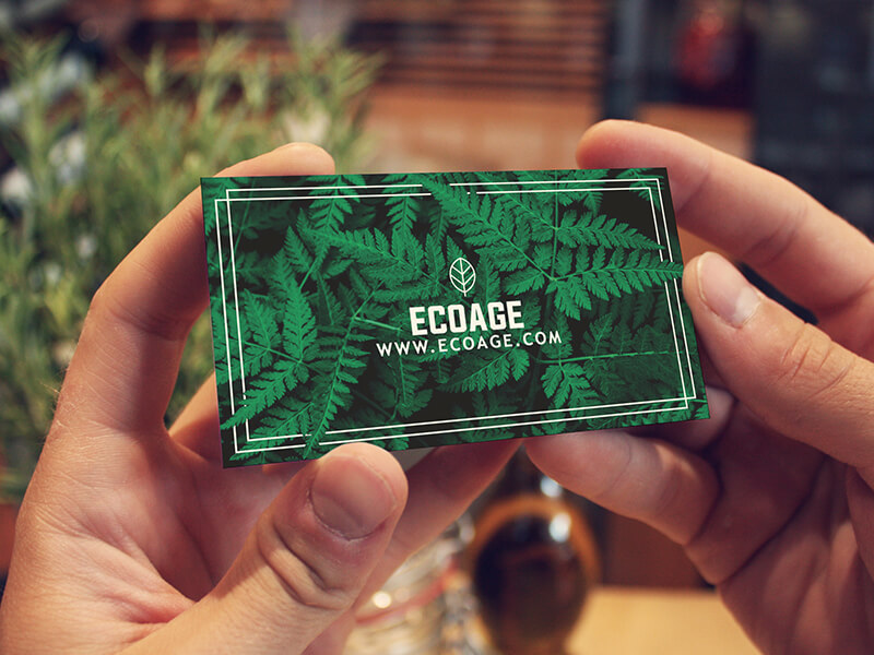
Green
Green is a natural colour that makes us think of freshness and nature. It’s also the colour for renewal and rejuvenation, and is associated with the ‘green light’, and indicator to get going and encouraging you to take action. In the US in particular it’s also associated with making money, and still across the world green is considered a colour of prosperity.
Blue
Blue is a calming colour that relaxes and soothes your audience, and is also a colour that implies intelligence and reliability. Blue is the colour of corporations and also implies responsibility and security. That’s why many social media companies choose blue as their colour, as it promises some security. If you’re a trustable brand or you want to encourage relaxation and calm, blue is the colour of choice for your business cards
.
Yellow
Yellow is considered a happy, vibrant colour, and a colour that symbolises hope and positivity. It’s also a very eye catching colour, so many use splashes of yellow to draw attention to something. Just remember to pick the right yellow – bright yellow grabs attention, pale or warm yellow is considered healthy and gentle, while neon yellow is artificial.

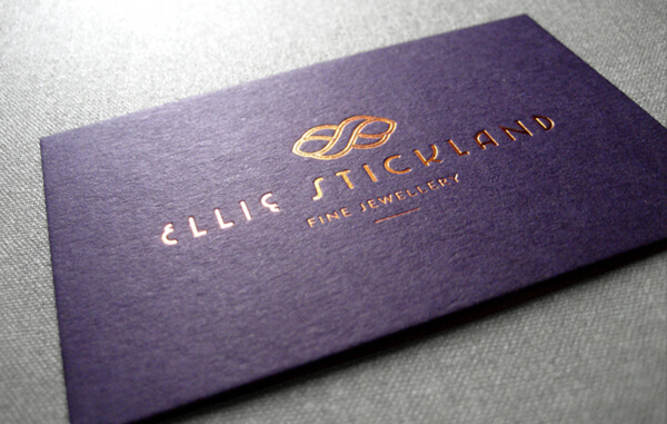
Purple
Purple is the colour of royalty and prestige, and thus can be seen in the branding of many luxury brands and jewellery stores. Purple is also mysterious and spiritual, so if you want to evoke some mysticism then use purple in your business card. Pair it off with a hint of gold for that extra luxury, especially if you are a luxury brand.
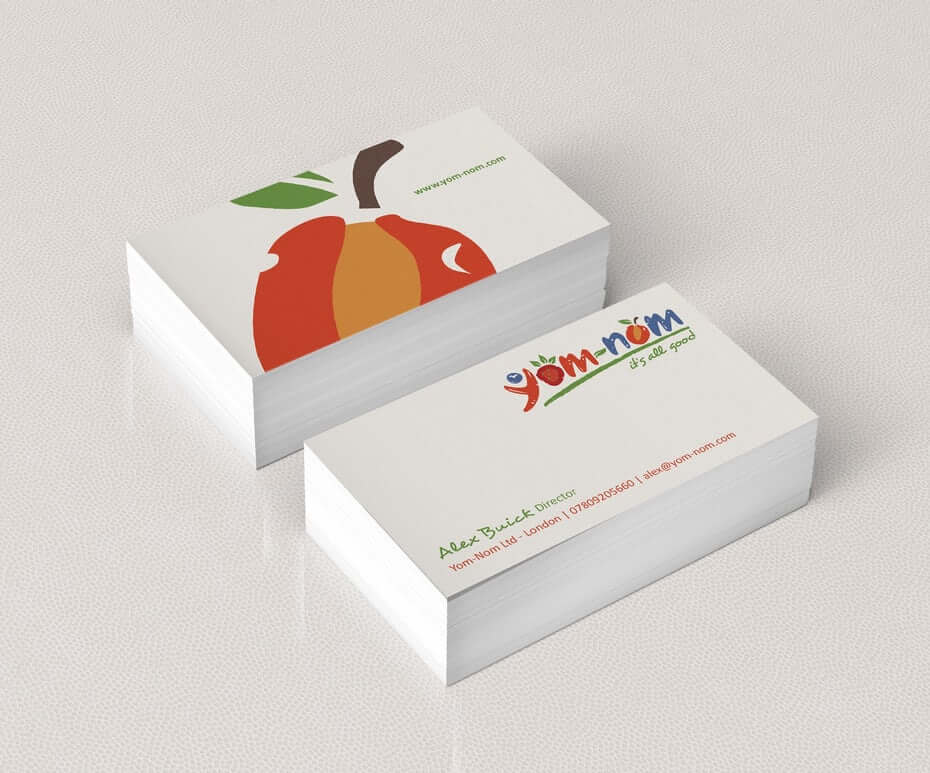
Orange
Orange is a young, creative colour that catches the eye and invokes energy and enthusiasm. It’s attractive but more subtle than the harshness of red, and it can bring to light matters of health and vitality. But most of all it’s a fun colour, and can highlight something important on your business card! If you’re a young and funky business, or a creative one at that, then orange is the colour for you.

Black
Black is a sophisticated colour and has an elegant feel to it. At the same time brands that use predominantly black can come off as unapproachable and intimidating, especially if they are top-end brand. Black can also come off as bold and mysterious, and if you want to highlight something you just have a bright colour on a black background, which looks stylish and eye catching.

White
White gives off an air of elegance, sophistication and minimalism. It can also represent purity and innocence, especially for a children’s brand or a wedding brand. It’s recommended however to use white with care however, as people are more likely to forget about or toss white and black business cards, unless you’re an established brand that doesn’t have to strive to be memorable. If you’re using white for your business card, perhaps opt for an additional splash of colour.
Pink
Pink is a feminine, romantic colour that can be both subtle or bold depending on what shade you opt for. It can similarly be playful or sophisticated, and it pairs with many other colours fairly well. In that respect it can work for many styles of companies; you just have to pick a shade that works best for you; soft pink for elegance, hot pink for playfulness. At the end of the day pink is ultimately a feminine colour, associated with feminine brands.

Brown
Honest, homey, authentic, earthy, rustic and organic; these feelings are associated with brown, a natural colour that is neutral enough to be paired with many other colours. It’s associated with the outdoors and nature, as well as organic materials. So it’s often used for rural themes or organic ones. But additionally it can also be sophisticated, with dark rich colours.
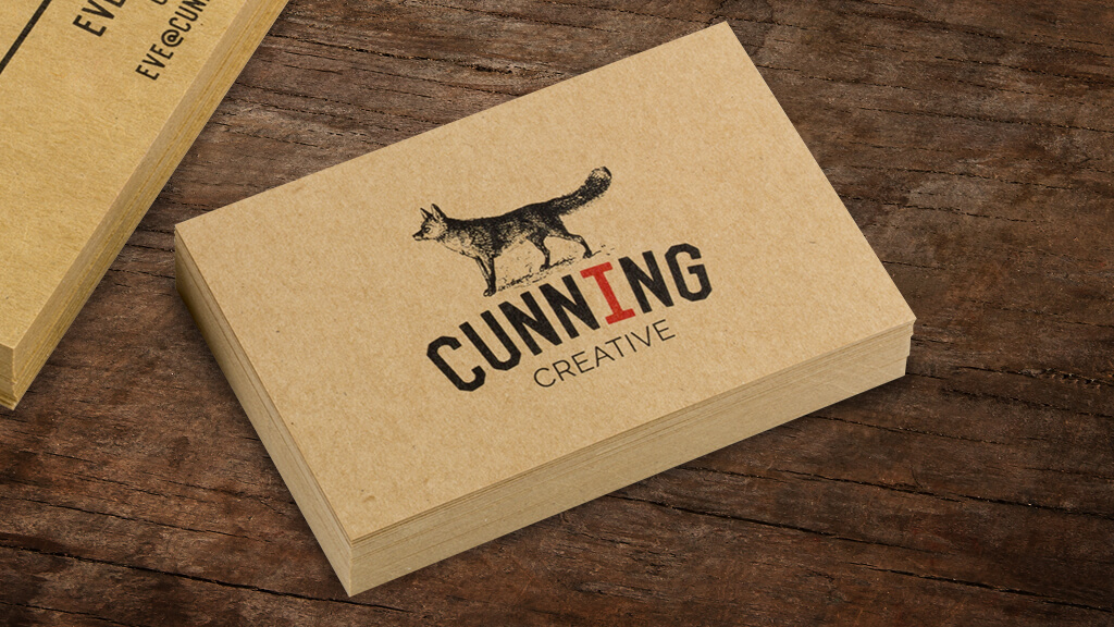
Take these Colour Meanings into Account When Designing Your Business Card
With these colour meanings you can most effectively choose the colours that suit your brand identity best. And once you have your design you’re going to need a printing company to print your business cards in bulk for you. We provide bulk business card printing services for your convenience, with the highest quality output. Feel free to contact us to find out more.

